Week 6 - Life drawing - tonal drawings

We've started this lesson with 5 quick drawings, then we did two 5min drawings which we were supposed to create using only/mostly tones, not lines. After that we focused on tonal drawings. I think the works from this lesson are amongst the worst of my works. They are not all horrible, but they are not exceptionally good either.


 This one was supposed to only use black and white, no midtones (at least that's how I understood it). This one is a disaster. It doesn't fit proportionally...at all.
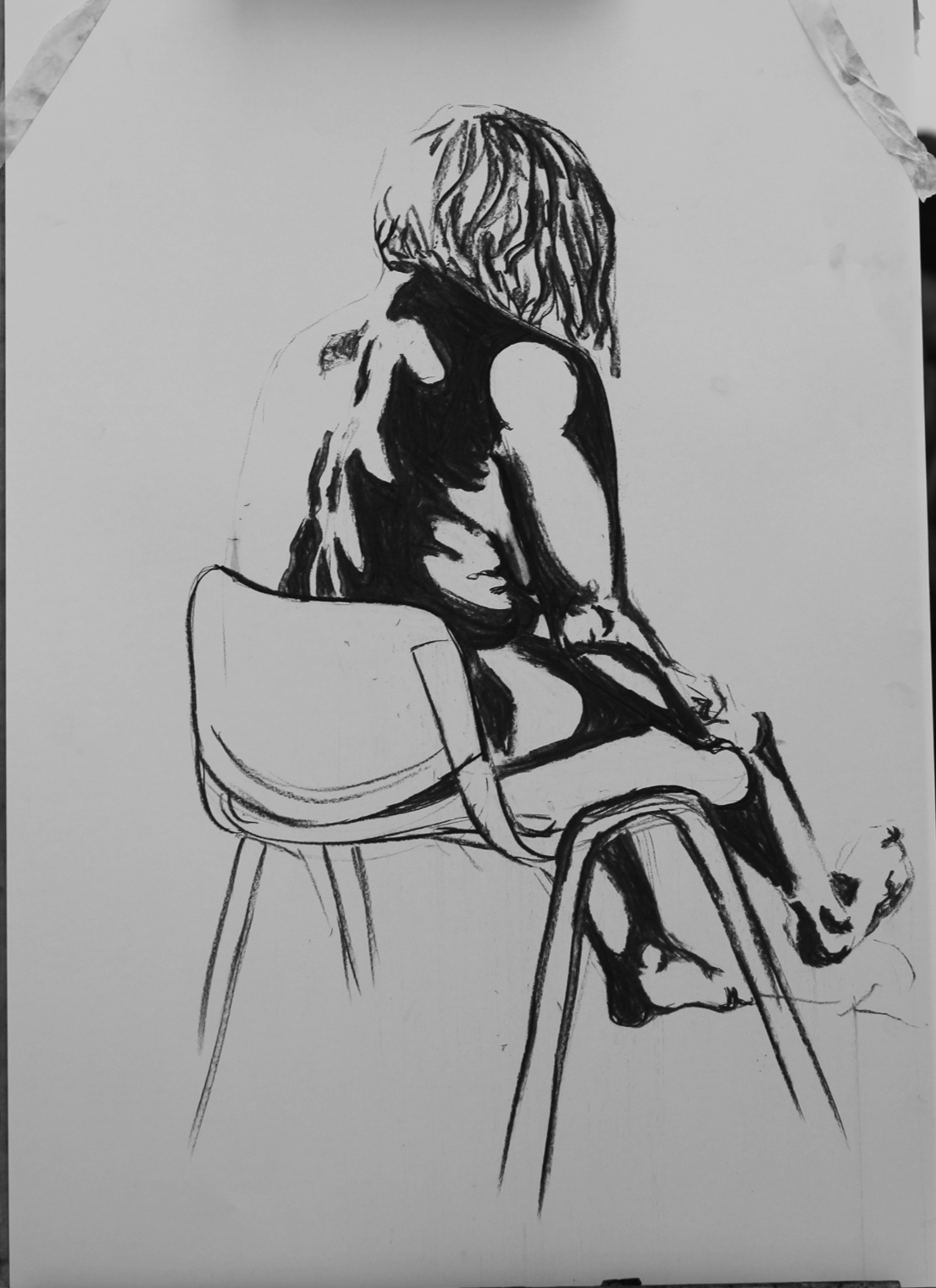
 This one is a bit better I think. I've tried to exaggerate the shadows and lights even more than in the last drawing. I kind of like how contrasting it looks. 
 This one was done with hard pastels and it's a complete fail. It's all just scribbled, I didn't really know how to work with them so shading is just not happening. The proportions are all wrong, I don't even know what is the worst part. It looks like I was on three kinds of drugs, definitely not my best work.
This one is a bit better but I could've chosen more contrasting colours because now the difference between light and dark is almost lost.
 I'm not very satisfied with this one either. I should've started with darker shadows so I wouldn't have had to go back to them so many times. The proportions could've been worse considering that I couldn't erase the sketch, but I wouldn't consider it a very good drawing/painting. 

Pixilation beat board

For the pixilation project I will be working with Karolina. We have already agreed on a story and this should be our beat board. It shows the key moments in our story, the theme of which will be an apocalypse.
 The first 8 frames are the beginning, they show the preparations (order may change later on). The following 6 frames are the middle. There are less frames than in the beginning, but the scenes will last longer so it should all be in balance. The last two frames are the end - where everybody's dead. 
We plan on shooting the whole thing in our hometown during the christmas break as we know the locations there better

Me:
Karolina:
1,4-me, 2,3-Karolina

Week 5 Homework - subtractive tone self portrait

This week our homework was to make 5 subtractive tone self portraits - 3 portraits and 2 whole body drawings. 
As advised, I've tried playing with some facial expressions and got some very creepy results. 

 For the first drawing I've hung the light above me and went for rather neutral expression. I like the overall look of it, but I can also see that the eyes are uneven and a little too big, the nose is too narrow and the shadows around the eyes are too sharp. 
 Here I've had the light on my knees which made everything so much more difficult because it was moving constantly and changing the shadows. Also smiling like this for around 30 minutes is not easy either. I like this less than the first one, I feel like I could've done a much better job. It's not very proportional, one cheek is higher than the other, eyes are too big again and it all looks kind of poorly done.
 My favourite part here is probably the mouth, though it is not placed correctly. My left eye is too low I think and at a wrong angle. I honestly hope I don't really look like this.
 These two were a bit of a problem since I don't have a big mirror, but I've figured out how to make it work. This first one is me sitting on my bedside table. The hardest part was drawing my left hand because it kept moving as I was drawing with it and so the shadows and negative spaces were always changing. I think this is maybe better than the portraits because I wasn't focusing on so many details. 
This one has a lot more anatomical errors than the previous one in my opinion. Again, drawing my left arm was very difficult. But I think the shadow on my right leg turned out quite good. 

I have some mixed feelings about this exercise. On one hand, these were actually a lot of fun to draw, on the other hand, the results are not all that good. I'm still not used to this way of drawing. My favourite ones are the first portrait and the sitting one. I definitely still have a lot of room for improvement.

Week 5 - Leaf

This week we had to animate a leaf blowing in the wind. I've started my animation with the leaf on the ground because I thought it would be interesting to see it just kind of shuffle on the ground before being picked up by wind. I've coloured one side of the leaf so it's clear that it's turning and twisting because otherwise it might go unnoticed as the leaf moves pretty fast.
Here are some sketches I've made for the trajectory and movement of the leaf.

I've tried to focus on timing and make the leaf speed up/slow down at the right moments. The slowest parts are at the tops of the loops, after those the leaf picks up speed and it almost stops at two points (It was supposed to boil for longer but it looked kind of like the animation got stuck so I've decided shorter boil is better than wrong looking boil).
This was fun even though sometimes I didn't really  know how to twist the leaf the way I want to. I can't say I'm not happy with how this turned out, but I'm sure I could've done better.


Week 5 - Life drawing - subtractive tone

This week we focused on light and shadow. We covered the paper in charcoal and then erased the lightest areas, added the darkest areas, ... I've never done a tonal drawing this way so this was new and challenging for me. I feel like these were definitely some of my weaker works.
 The first obvious problem here is the composition. The figure doesn't fit on the paper and the proportions are all wrong too. I guess I've ignored accuracy while trying to focus on getting the light right. I'm also aware that I wasn't really drawing the figure as a whole which was probably the main reason for the disproportionality. 

 While working on this I felt like it was going pretty well but now I'm not so sure. The shadows could've been darker and there are almost no midtones, making it look flat. 
This was the last, 20min drawing. Aside from the rushed background I think it turned out ok. Still a lot of things to improve, but at least the proportions are better than in the first one. 

Week 4 Homework - The Accountant

This week for homework we had to design a set with the title "The accountant". I knew right away I didn't want to do just a normal office. I've considered several ideas and settled on the hell's accountant office which contrasts Karolina's heaven's accountant. 
I wanted the office to look more luxurious rather than just dark and scary because if someone has golden floor in their office it's definitely demons. 
I really enjoyed this homework, it was fun coming up with a set and even though I'm sure I could  add a lot more details if I spent more time on it I'm quite happy with how it turned out. 


wall candle holders
 the accountant's hellhound

Week 4 Homework - Hands

For this homework we were supposed to draw five hands holding different objects. Hands have always been a nightmare for me, I can never get them quite right, so I was a bit scared of this task. The end results do resemble hands though, so I guess it wasn't as much of a disaster as I'd expected.

Pencil
I've started with a pencil drawing because this is the medium I'm most confident with. 
 Charcoal
For my next drawing I chose a knife and used charcoal because I feel like charcoal can create very dramatic effect which went well with the chosen object. This is probably my favourite drawing from this homework. 
Watercolour
This wasn't the best choice of medium, as the sketchbook doesn't have watercolour paper and I couldn't get as much shading done as I would've liked. It was also pretty challenging working with watercolour while holding sunglasses in my hand. 
 Pen
Looking back at this, I could've done a better job shading this one. 
 Coloured pencils
On this one I've worked with Karolina, to whom the other hand belongs. We thought it might be interesting for the held object to be another hand. This was a very challenging drawing and took me about twice as much time as the other drawings. I'm aware that there are some anatomical mistakes and some parts look really off, but at least I've managed to finish it. 

Week 4 Homework - washing line

This week we talked about cycles in animation and for homework we were supposed to create a cycle of a washing line. I wanted to make it more dynamic so I've tried to make the wind seem quite strong. I like the way the clothes go up but not so much how they return to the first frame. I think maybe if I had added 1-2 more frames where the clothes would swing the other way it would've looked better. I've also tried to make the line itself swing a bit in the wind but the movement is too small to be noticable.
I chose the pose to pose aproach because I knew where I wanted the clothes to end up. I drew the first and the last frame, then one in the middle and added frames inbetween those. 


Week 4 - Cycles

In this lesson we learned about cycles and our task was to create a cycle of a flag in the wind. I'm not very happy with my animation as it's not very smooth and looks like it's just waving back and forth which looks kind of stupid.
The main problem is probably that I've tried to put too much movement into too little frames. Therefor the differences between frames are too big to create a smooth movement. 


Week 4 - Etching and printing


This week we continued working with the collage characters (though we could create new ones). We did drypoint printing, which I've done before, but I've only ever done it with foil and also lino carving. 
The way the parts of characters mixed was definitely interesting and more often than not had very weird results. 
Here is a sketch of my character, from which I only got the legs in the end.

I ended up with this long necked thing with very nice legs. 


I felt like the rest of the body was a bit too casual compared to the legs so I dressed him up, gave him a rose, some bows and a pair of arms to hold his wine glass. 


Week 3 - Sound

This week our task was to create an animation that would fit with a sound. I've chosen a sound of a firework. Animating the rocket was the easier part as it was very similar to the balloon I've animated the week before. The firework itself was a lot harder. I wasn't sure what to do where the fireworks meet so that was a bit chaotic but overall I think it's pretty good. I was also a bit worried the sound wouldn't fit, but it fits just fine so I'm quite happy with how this turned out.
I've used the squash and stretch principle in the beginning to make the rocket apear more dynamic. There's also a very short moment of anticipation when the rocket disappears in the distance before exploding into fireworks.


I have later decided to try how it would look with a dark background and white lines so I've inverted the pictures and here is the result.


At this point I figured I might as well add colour so I've played with it in photoshop a bit.