Assesment 1 - Animatic

This is my and Karolina's animatic for our pixilation film. (It doesn' have a title yet but we're working on it) 

The film is about the apocalypse but told from the perspective of those who cause it, the people who die in the film are just objects that get in the way. 
With the soundtrack we were going for something creepy, dissonant, and weird. We've decided to gradually add different sounds like scratching, white noise and a heartbeat to create the right atmosphere for the film. 

Final Brief - Animatic

This is my and Karolina's animatic. We've decided to make our animation a biť longer than required. We are aware that some parts aren't timed as well as they could be and we plan on fixing that. Considering the length of the video, there probably should be more frames, but I think as a first draft it's not too bad. 


We've tried to rework the animatic. It's still not the best work we've done but it's a bit better.


Week 9 - Location drawing - Worcester museum

This week we went to draw at the Worcester museum and I was expecting there would be more stuff so I was a bit disappointed but I've managed to find some things I liked.

The first drawing is an object symbolising the phrase 'man-made'. I chose the glove making cabinet because it had both the made objects and the tools to make them so I thought it fit well. It turned out messier and less detailed than I hoped, though, so I did a second drawing of just the sewing machine. Maybe if I hadn't used charcoal it would be easier to have control over the details. 
 For the 3 man-made objects I picked things connected with war. I chose not to draw the "ornament" on the helmet and tried to focus on the reflections instead. Not really happy with this one, it looks kind of deformed. 

For the one object symbolising nature I drew this fossil. I've decided to use coloured pencils for all my nature drawings while all the man-made drawings are in black and white.

 I wanted to get a kind of sense of hierarchy so the owl is on the top with the stout underneath, but I couldn' find anything that would fit in the bottom so I drew the leaves from the bird exhibit. I don't work with coloured pencils often so I'm not very confident with them, but I enjoyed working with them.


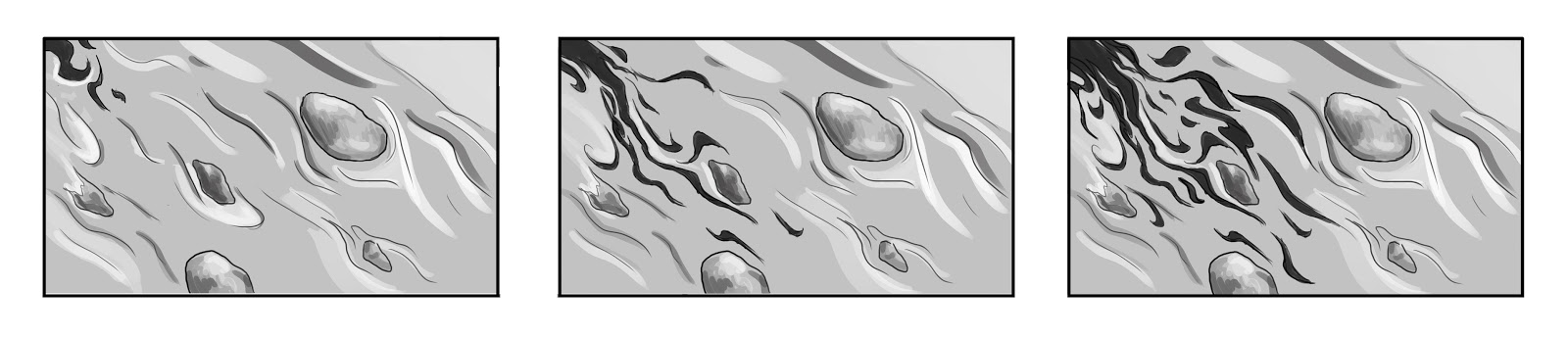
 I did the last interior/exterior drawing on a piece of brown paper and I don't like it at all. When I was drawing it the perspective looked a lot better. I have honestly no idea how I could've thought this looked okay.

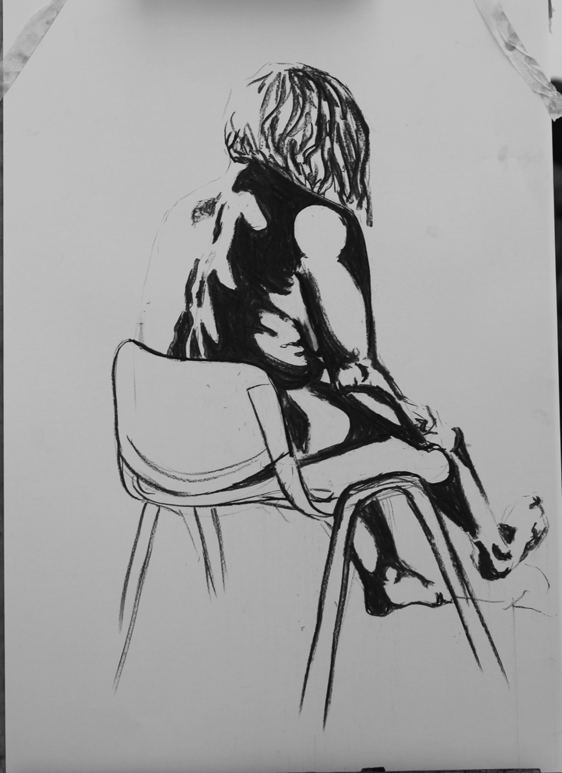
There weren't many people to draw and those who were there were moving way too much for more than just quick sketches.

I know I erase a lot so I wanted to try something I can't erase and did these bottles in ballpoint pen. 


Assessment 1- Animatic WIP

We've expanded the scenes from the storyboard to make into an animatic. 
We are also currently working out the durations of specific scenes and putting together a soundtrack to go with it. The whole film will be in black and white. The scene with snake had to be cut out because we couldn't get in contact with the owner of the snake and we didn't want to plan something we weren't sure would be possible and we wanted to cut something out to make the film shorter anyway.
The opening scene should be 3 seconds long and it will be just a single rose wilting.


The last scene of the preparations will be a death summoning ritual.


Final Brief - WIP - soundtest

Final Brief - WIP - soundtest
The first 18 seconds of the song are just music and here is a little sound test we did to see if the timing works.
Link to video
We will probably add more frames in the future and play a bit with the movement of the waves, but for now we're happy that it's in sync with the music.

Final Brief WIP

Karolina and I are animating the song I Wanna Be Yours by Arctic Monkeys. Our goal is to animate the first 1:14 of the song. In terms of movies, it could be the opening sequence of a romantic comedy as the song is about love but the lyrics are kind of ridiculous. The style of the animation is inspired by the music video for Do I Wanna Know (also by Arctic Monkeys). 
The general idea is that throughout the animation there will be a line from which all the animated objects will form. I will be animating a Ford Cortina, a shooting gun and an exploding heart.
The hardest part will be definitely getting the animation in sync with the lyrics


Here's our timing sheet (yes, it's very messy and chaotic) 
 Here's the actually important part.
 some more sketches for the formation and movement of the car and the gun

Week 7 Homework - Framing

For homework, we were supposed to pick a film and then storyboard the key points of a 15-minute sequence. I chose the movie "Constantine" because I like it and as it turns out it has some nice framing (at least in  my opinion). I did the last fight/action scene from the movie. There is a lot going on so I wasn't able to do all the frames I'd have liked to because that would take me ages and it would be way too long. These should be some of the more important frames story wise, if someone hasn't seen the movie though, they'd  probably be really confused because there's a lot of information missing.


Week 7 - Framing

We watched a scene from Alfred Hitchcock's film Rear Window and then we made a storyboard for it with focus on framing. The windows often acted as frames within frames, making it more interesting.

Week 7 - Life drawing - painting

This week we did painting with acrylics.I like acrylics because of how you can layer them, but I've never worked with them this fast so I'm not really happy with my results.

 For the first two paintings we could only use two colours + white. I was using blue and yellow, but because I very smartly only prepared one brush by the end I was working with various shades of green. 
 Here I've also attempted a bit of a background, but maybe I should've spent that time on fixing anatomical mistakes. 
 For the last two paintings we could use more colours. I've picked violet and blue for shadows, ochre for light areas and I've tried to do the midtones with some kind of reddish-pinkish accident of a colour but gave up on that plan after about three brush strokes. I thought using more colours would make it easier, but it just slowed me down.
I feel like I've had a lot more control over what I was doing. Not necessarily meaning it's better, but I was feeling a bit less stressed and my work was a lot less chaotic. I know that we don't have to draw the foot when she's sitting like this and can only focus on her back and I also know that I always get the foot wrong but I am determined to try it till I get it right. 

In general I think that I sometimes freak out too much about not having enough time and I chaotically try to get as much done as possible and then I have to go back and fix everything because I've screwed up. I've also noticed that I tend to squish her a bit, for example in the first painting. 

Week 6 Homework - Lighting and chroma keying

Week 6 Homework - Lighting and chroma keying
We did this together with Karolina. At first we had some trouble setting up the lights and getting everything to work together, but we figured it out (mostly). We wanted to play around with the lights a bit, there ended up being too much light on the green screen making it hard to key out later, but I'm sure it could've been worse. 
Here's the edited version. It's not very good, but at least now I have some experience with the software. 

Week 6 Homework - Cafe drawing

This week our homework was cafe drawing...or any speed drawing of people really. I was both happy and worried about this because I always feel so awkward drawing in public spaces, but I know that I can only improve if I practice and if this wasn't for homework I just wouldn't push myself to do it. I do like some of these, but I think I draw too many unnecessary lines and that slows me down. 


Week 6 - Life drawing - tonal drawings

We've started this lesson with 5 quick drawings, then we did two 5min drawings which we were supposed to create using only/mostly tones, not lines. After that we focused on tonal drawings. I think the works from this lesson are amongst the worst of my works. They are not all horrible, but they are not exceptionally good either.


 This one was supposed to only use black and white, no midtones (at least that's how I understood it). This one is a disaster. It doesn't fit proportionally...at all.
 This one is a bit better I think. I've tried to exaggerate the shadows and lights even more than in the last drawing. I kind of like how contrasting it looks. 
 This one was done with hard pastels and it's a complete fail. It's all just scribbled, I didn't really know how to work with them so shading is just not happening. The proportions are all wrong, I don't even know what is the worst part. It looks like I was on three kinds of drugs, definitely not my best work.
This one is a bit better but I could've chosen more contrasting colours because now the difference between light and dark is almost lost.
 I'm not very satisfied with this one either. I should've started with darker shadows so I wouldn't have had to go back to them so many times. The proportions could've been worse considering that I couldn't erase the sketch, but I wouldn't consider it a very good drawing/painting.