Opposites - collage

Opposites - homework:


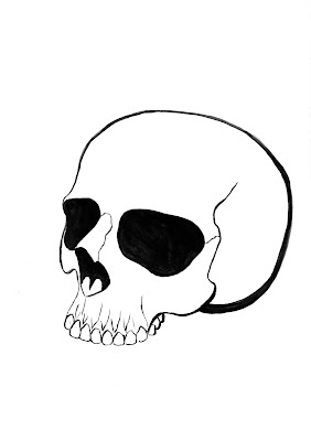
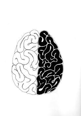
We were to create a collage that would represent opposites. I didn't want to use too many of the drawings so I picked life/death and heart/mind because I felt it would look nice together and thought it would communicate the theme well..


When working on composition I've noticed it looked like a playing card so I chose to use only red and black. 

Progress pictures:


Week 2(2) - Hands, portraits

This week, instead of the whole figure, we focused on details, specifically face and hands. 
For me those are some of the hardest things to draw. I often get the proportions wrong or the whole thing looks deformed. 

At first we did some really quick face sketches. For the 20 sec. ones I only had time to draw a couple lines and they don't even look like faces. The longer sketches look a bit better, but it's obvious I don't have much practice in this area and will have to work on it a lot to get better results.


These two are my least favorite drawings from this lesson. The proportions aren't very accurate and the one on the right is slanting noticeably. The left one is a bit better, but the angle of her nose doesn't seem right, making the whole bottom half incorrect. 

The profile drawings were a bit better, especially because in the first two I didn't have to focus on any other elements besides the outline. 
 
I've always had trouble drawing hands. The top right drawing was the first one and I can see just how inaccurate it is. Some of the fingers look like they're broken. I struggled with the others too, but they do look better than the first one. The top left one was the last one and I am relatively happy with how it turned out. I didn't want to shade them smoothly to give them a bit of structure and I am glad i made that decision.