Week 7 - Illustrator

This week we started working in Illustrator. I've never worked with it before so I didn't really know what I was doing, I was just hoping it would turn out fine. 

First we made some faces with just some basic Illustrator tools
It's not the best thing I've ever done, but I figured out most of what I was trying to do...even if some of it was just by accident


Then we vectorised one of the drawings we did for homework.
It turned out fine, though some of the lines are a bit thick so maybe I should've tried to adjust them somehow. I was worried about how this would turn out, as the lines aren't perfectly smooth and I didn't know if it wouldn't look too jagged and messy in vector, but I actually like how it looks.


It didn't turn out too bad. I could've maybe disconnected the lineart of the flower from the rest and coloured it dark blue. 

Vectorising a photo was a bit harder. I wanted it to be just black and white, but some parts weren't contrasting enough so I went for full colour and later decided to add the black part on top of that. I've decided to add a space background, using similar colours to her hair. At first I wanted to do the different shades as shapes, but it didn't feel right so I tried scribbling with the smallest possible blob brush and the results looked interesting so I went with that.


Overall, working in Illustrator isn't so bad and I like how the results look. It will still take me some time to get used to it, but hopefully at some point I will at least kind of know what I'm doing.

We then had to create a portrait using the curvature and/or pen tool.
I have worked with the pen tool in photoshop before and we never really got along, so I wasn't looking forward to this, but it wasn't that bad. I intended to do this differently in the beginning, but then I decided to just focus on working with the pen tool, get used to it, and maybe try something different another time.
Here are progress pictures:


And the final result:
I liked doing her hair, even though sometimes the lines just wouldn't do what I wanted them to.


Week 6: gifs

This week we made gifs from our drawings. I knew you could make gifs in photoshop, but I've never tried it before. It was fun, they turned out pretty good (I think), but I know that if I'd spent more time on them they'd be a lot smoother. 

The first gif I made was of a flytrap...


I was a bit worried about how this would turn out, but I like the result. 


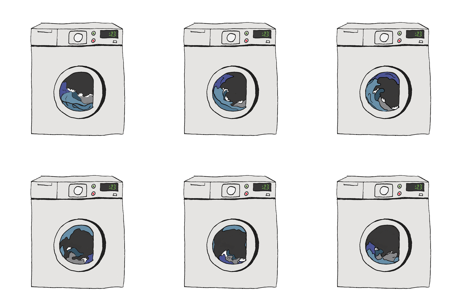
Next I did a washing machine...


 I'm not as happy with this one, I think it's a bit rushed. What could also improve it is maybe a blinking light, or the whole washing machine could be shaking slightly.


I've also made a third gif - of a wave


It was a bit more complicated than the other two because the whole thing is moving. I think maybe I should've added some more frames to make it a bit slower in some parts. I've tried playing around with the timing in photoshop, but when some of the frames were there for longer than others it just looked like it was getting stuck in places which I didn't like. This was the best result I was able to get with what I had. I could've also added some more shades of blue to make the water look less flat.

Week 7(2) -

We started the lesson with some quick warm up sketches. I feel like I'm getting a bit better at capturing the pose even in a short time.

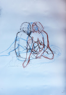
Here we drew the model 3 times from 3 different angles. It was very confusing at times, I didn't always know how exactly what I'm drawing looks like because it was mixed with the other drawings, but it was an interesting exercise. 

For the last two drawings I decided to work with coloured pencils, because I wanted to work in colour and work on shading. The first drawing didn't turn out too well. There are some relatively good parts, I think the legs are kind of good, but then the head is completely wrong. It is wrong proportionally, I don't think it's even positioned right, but because coloured pencils are hard to erase I could only try to draw over it to correct it, but even if I got it right at some point, it is now lost in the mess of lines. 

The second one is definitely better. There are still a lot of things that could use fixing, but at least it looks almost finished.

Week 6(2) Independent study - movement

For this week's homework we had to draw 4 movements.

For primary reference I watched my friend put things on her shelf. I've noticed that I often draw different poses in different height, making it look like the figure is jumping or something so I should probably work on keeping the drawings in line.
For the second drawing I wanted something a bit more challenging so I asked my friend to climb on the desk and jump off a couple times so I could try drawing that. Some of the poses look quite good, but I think the jumping itself is not very dynamic.

For secondary reference I first chose a video of my cat playing with something. That proved to be just way too fast to capture, so I tried slowing it down a bit, but it was still too fast. I tried drawing it anyway, but I feel like it was way above my skill level. 
The second drawing is part of a contemporary dance video and it was slightly less difficult than the cat, but I still struggled a lot. Next time I should probably pick something simpler to start with, even though I did manage to draw both the cat and the dance. 

Nullibicity - visual research

We've decided to make the animation in  kind of futuristic cyberpunk style which I think is very aesthetically appealing. It also makes the script work much better in animation rather than live action.
here are some pictures we could take inspiration from...


Week 5 - Patterns

This week we made patterns from our drawings. The process wasn't too difficult and the results are nice. 


Th first pattern is probably my favorite one. I was a bit worried that it would look like square tiles, but because of how I've placed the snakes and jellyfish, it looks fine.


This one looks a bit boring in my opinion. Maybe I could've tried colouring it to make it better. 


I've tried several versions, but I should've played with placement more.


 This was a line drawing too, but I coloured it in photoshop. Maybe it would look better with a background or some other objects inbetween.


Here I've added background. I guess it would look better with one more fish in the middle


 This is the last pattern I did. 


 And here is my patterned snake.