Week1: Collage

This week we did a collage in photoshop, which isn't something I usually do. It was fun though.  


My collage doesn't represent any specific dream, it's more like general representation of dreams and nightmares. It wasn't very difficult, but I could've played with it more, maybe experiment with layer styles or something.

Here are some progress shots:


Week 1(2) - Group critique and tableaux

In the first lesson we did a critique of our work we did over the Christmas break.
It was very interesting to see how others have approached the brief and to read what others think about my work. Some people pointed out that I should add more annotations to my work, which is true, I rarely remember to do that. They also mentioned I could work in colour more, but the feedback was generally very positive. 

Then we looked at the term "Tableaux" and in groups tried to think of our own tableaux.
First, we were drawing the first group, whose tableaux represented gossip. It was much harder than drawing just one model because I had to focus on spaces between people and obviously because there were more people to draw so I couldn't just spend the whole time getting one person right. I tried to do as much as possible in the first 10 minutes so that I could focus on fixing mistakes and maybe adding some details in the other 10 minutes. 
Our tableaux was "the uninvited guest at the birthday party" and I have to say that standing in one position for 10minutes is a lot harder than it looks. 
It was a fun thing to do, something different than usually.


This semester I would like to stick less to my comfort zone and experiment a bit more. I've tried new things last semester too, but I still tend to try and play it safe. I think I tend to ignore the technical aspects of drawing, like proportion or angles, when I'm trying to convey some emotion in my drawings, so I should work on finding a better balance in my work. I also feel like I tend to exaggerate foreshortening sometimes so I will try to be more careful about that. 

Weeks 11/12 - location drawing

I did my brief in my hometown Banská Bystrica, mostly because I know it a lot better and so it was easier to find what I needed. Part of my sketches was done in the historical centre of Bystrica and part was done where I live, showing the difference between the old architecture and the new. I think I would've enjoyed this brief more if it wasn't freezing outside, making drawing a living hell.

City centre:
Top left/Right: The Parish Church
Bottom left: City hall

Top: City hall
Bottom: SNP square (the leaning clock tower, plague column, The Church of Franz Xaver)

Left: Town castle
Right: Ebner's house(?)

Top: Kammerhof
Bottom: a bank
SNP square

Pršianska terasa (where I live and surrounding streets):


These are the pieces I did for the 6 words. 

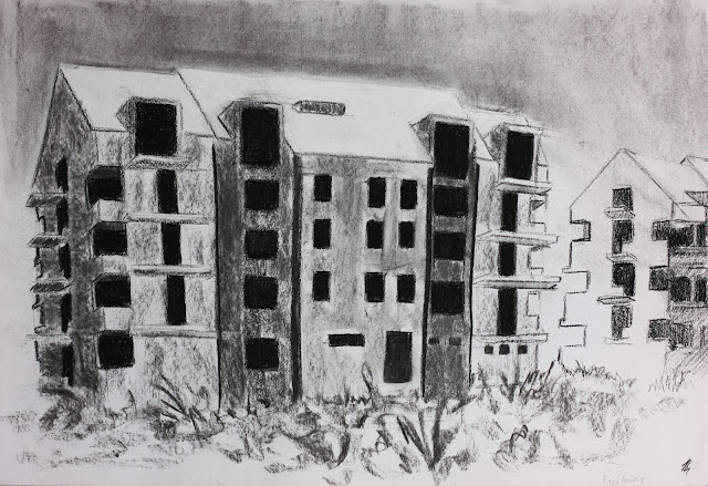
For Frightening I drew one of the unfinished buildings across the street where I live because they have this kind of post-apocalyptic, abandoned feeling about them, especially in winter. I chose charcoal because it makes everything look more dramatic.

For Muffled I chose a half fallen apart building overgrown with trees and bushes. In summer you almost don't notice there is a building at all because it's hidden behind all the foliage. 

For Fevered I picked this weird looking house. There's just so much going on, it was the first thing that came to my mind with that word. I did this one in acrylics because I wanted to do it in colour and acrylics can be layered so I can hide my mistakes under layers of better looking mistakes.

For passive I chose part of the city walls that once surrounded Bystrica, but now they're just crumbled bits and pieces of stone. I felt like that conveyed passivity well. I used pen because I wanted to try different techniques than usually and I think it was a good choice for drawing a stone wall

For erotic I really didn't know what to draw. This one took me the longest to find something for and even now I'm not quite sure about my choice. I ended up painting two joining highways that I tried to make look more dynamic with brushstrokes.

For Transcendent I chose part of a church. I originally wanted to draw light coming through stained glass windows, but the weather refused to cooperate. 

I don't like drawing buildings and architecture too much, but I tried to find some ways to make this brief more interesting for me. I think that despite everything, the outcomes are relatively good.

Final Animation

This is my and Karolina's final animation. 
The requirement was a 30 second video, but we've decided to go for almost 1 minute.
It was definitely very challenging and we're happy that we've made it this far, even though we've had to cut a couple seconds from the end (it's about 17 seconds shorter than our animatic)


The work was divided as follows:
1 wave: Karolina
2 waves: Me
Vacuum cleaner: Karolina
Cortina: Me
Coffee pot: Karolina
Gun: Me
I just wanna be yours: Me
Heart, chains: Karolina
Heart, shattering: Me
Maybe I just wanna be yours: Karolina

We divided the animation in this way to give it a more seamless feel and so that we both got to basically do all kinds of elements in the animation.

Here is the non-inverted version of the animation


You may notice that the wave and beat are not in sync and that's because I forgot to put a line after each repetition of the cycle, but that's been fixed and the final version is as accurate as we could get it.

The hardest part of animating this turned out to be fitting things into certain time frames...before, if I did more frames than I'd planned I just had more frames. The gun was particularly tricky because there was very short time after the shot to "unravel" it into straight line again.

Overall I'm happy with what we've achieved. There's always room for improvement, but we've both done the best we could.


Essay: Can the animated form be categorised?

Essay: Can the animated form be categorised?

Animation is a wide term. Basically, any form of art which is moving could be considered to be animated. For a group that large, there should be a way of systematising it. In his book on the theory of animation, Understanding Animation, professor Paul Wells suggests that all animated forms can be simply sorted into two categories. Those categories are orthodox animation and abstract/experimental animation. He briefly mentions a third category – developmental animation, which should incorporate elements of both categories but does not elaborate further or mentions an example. The different characteristics of each category are neatly summarised in a diagram (1998, p.36) that shows them as exact opposites with the developmental animation balancing on a line between the two. Wells later discusses and describes the individual elements, labelled by him as the Terms and conditions of animation. (1998, p.36).

The terms for orthodox animation would be configuration, specific continuity, narrative form, evolution of content, unity of style, absence of artist and dynamics of dialogue and the terms for abstract animation would be the opposite, that is abstraction, specific non-continuity, interpretive form, evolution of materiality, multiple styles, presence of the artist and dynamics of musicality. While defining these phrases, he himself sometimes admits that not everything is as black and white as he would like and that not all animated films strictly follow these ‘rules’. The model Wells presents could work on some films, but it is flawed and going only by the terms, many animations would not be included in either category or in both categories and the developmental category is so vaguely described it might as well not be described at all.  There are, though, films that fit into those categories well. For example, Steamboat Willie (Walt Disney Animation Studios, 1928) is a good example of orthodox animation. It uses narrative form, which means that the animation is in the form of a story. Chases and conflicts between characters are very common scenarios. The story is also continuous, even though there are many different things going on it is easy to tell we are still watching the same story. Even though the figures are not people we still recognise them as characters and that means the film uses configuration. Dialogue is not used extensively, but it is replaced by sound effects that correspond to specific objects or actions. Even in the earlier films, we can already see the Disney Studios style forming. The style remains the same throughout the film, signifying both unity of style and absence of artist, as multiple artists worked on this piece, yet it looks as if done by a single person and we cannot, therefore, recognise the people who have worked on it. Abstract animation could be represented by Walter Ruttmann’s Lichtspiel Opus (Walter Ruttmann, 1921), which was the first publicly screened animation. It only consists of circles, colours, flashing and moving shapes and all of that is accompanied by music. It perfectly fits the criteria for abstract/experimental animation. There are no figures or characters, only non-figurative shapes and forms in their place. Although the animation progresses and changes, it does not have a narrative and it doesn’t follow a story. The entirety of the animation is what the artist thinks and feels, how he believes the music should be represented. Revolver by Jonas Odell (Jonas Odell, 1993) could fall in the mysterious developmental category. There are recognisable characters, the style remains the same, we could talk about continuity, considering the years hinting at the passage of time, but there is no immediate connection between the scenes themselves. The animation doesn’t seem to have much in the way of a narrative aside from what the viewers figure out by themselves. The soundtrack is a lot closer to music than dialogue most of the time and when what could be called dialogue is used, it does not make any specific sense. Although this categorization is not ideal, it certainly offers at least a basis for sorting of the animated film. It might be also interesting to consider a different way of categorising animated film, for example, the time period, it’s purpose, used medium or genre, and then there is also a cultural aspect. Animation from Europe will not be the same as animation from America or Japan as these are different cultures with different values, art styles, levels of technical advancement and historical backgrounds. While in America animation was popular for example in advertising, in Europe, a lot of animation reflected, for instance, the political situation. Either as a propaganda animation, which thrived for example in the Soviet Union after it formed, or like in other fields of art, in its abstract form as a way of protest against the current situation.
  
Wells repeatedly declares that the hyper-realist cel animation, such as the work of Disney or Warner Brothers, is the dominant form overshadowing the much more artistic experimental approaches. He agrees on that with historian William Moritz, who suggests: “Non-objective animation is without a doubt the purest and most difficult form of animation. Anyone can learn to “Muybridge” the illusion of representational life, but inventing interesting forms, shapes and colours, creating new, imaginative and expressive motions – ‘the absolute creation: the true creation as Fischinger termed it – requires the highest mental and spiritual faculties, as well as the most sensitive talents of hand.” (Moritz, 1988: 25) Cel animation is without a doubt the best known and liked form of animation as it allows fast mass production and works well for storytelling, for example for cartoons, but also because it is more suitable for a casual viewer who is merely looking for entertainment, not for any deeper meanings. Wells states that “Inevitably, the amount of cheaply produced, highly industrialised cel animation made in the USA and Japan has colonised television schedules, and perhaps, more importantly, the imaginations of viewers.” (1998, p.35) and expresses his desire to bring more attention to, in his opinion more valuable, abstract animation. Throughout the book, Wells seems to be strongly against the orthodox animation and all it has to offer. Again, agreeing with Moritz, that orthodox animation is basically pointless because everything that can be animated can also be done in live action and is, therefore, not real art, unlike experimental animation which requires higher level of skills. I personally do not see the appeal of purely abstract animation. Certainly, there are people who can appreciate it and both forms of animation have their place in the field of animated film, but the way I see it, abstract animation is meant more for its author rather than an audience. It could be speculated that orthodox animation is made for the audience and its entertainment while abstract animation, though shared with an audience, is created for the animators themselves.

To get back to the original question, certainly, the animated form can be categorised to a degree and the theory of Paul Wells could serve as a foundation for possible future categorisation systems if anyone ever attempts to create them. It may have been easier in its beginning before the technologies advanced too much and animation took on a life of its own.  Nowadays, there is so much animation being created in such a wide variety that some of it would probably fall in neither or both categories defined by Wells.
(1219 words)


Bibliography
Odell, Jonas.(1993) Revolver, Available at: https://www.youtube.com/watch?v=p2HEgnlmfss   (Date Accessed-30.11.2016)  
Ruttman, Walter.(1921) Lichtspiel Opus I, Available at: https://www.youtube.com/watch?v=FYJnZ946L1c   (Date Accessed-2.12.2016)  
Walt Disney Animation Studios.(1928) Steamboat Willie, Available at: https://www.youtube.com/watch?v=BBgghnQF6E4&spfreload=10  (Date Accessed-30.11.2016)  
Wells, Paul.(1998) Understanding Animation


Assesment 1 - Animatic

This is my and Karolina's animatic for our pixilation film. (It doesn' have a title yet but we're working on it) 

The film is about the apocalypse but told from the perspective of those who cause it, the people who die in the film are just objects that get in the way. 
With the soundtrack we were going for something creepy, dissonant, and weird. We've decided to gradually add different sounds like scratching, white noise and a heartbeat to create the right atmosphere for the film. 

Final Brief - Animatic

This is my and Karolina's animatic. We've decided to make our animation a biť longer than required. We are aware that some parts aren't timed as well as they could be and we plan on fixing that. Considering the length of the video, there probably should be more frames, but I think as a first draft it's not too bad. 


We've tried to rework the animatic. It's still not the best work we've done but it's a bit better.


Week 9 - Location drawing - Worcester museum

This week we went to draw at the Worcester museum and I was expecting there would be more stuff so I was a bit disappointed but I've managed to find some things I liked.

The first drawing is an object symbolising the phrase 'man-made'. I chose the glove making cabinet because it had both the made objects and the tools to make them so I thought it fit well. It turned out messier and less detailed than I hoped, though, so I did a second drawing of just the sewing machine. Maybe if I hadn't used charcoal it would be easier to have control over the details. 
 For the 3 man-made objects I picked things connected with war. I chose not to draw the "ornament" on the helmet and tried to focus on the reflections instead. Not really happy with this one, it looks kind of deformed. 

For the one object symbolising nature I drew this fossil. I've decided to use coloured pencils for all my nature drawings while all the man-made drawings are in black and white.

 I wanted to get a kind of sense of hierarchy so the owl is on the top with the stout underneath, but I couldn' find anything that would fit in the bottom so I drew the leaves from the bird exhibit. I don't work with coloured pencils often so I'm not very confident with them, but I enjoyed working with them.


 I did the last interior/exterior drawing on a piece of brown paper and I don't like it at all. When I was drawing it the perspective looked a lot better. I have honestly no idea how I could've thought this looked okay.

There weren't many people to draw and those who were there were moving way too much for more than just quick sketches.

I know I erase a lot so I wanted to try something I can't erase and did these bottles in ballpoint pen. 


Assessment 1- Animatic WIP

We've expanded the scenes from the storyboard to make into an animatic. 
We are also currently working out the durations of specific scenes and putting together a soundtrack to go with it. The whole film will be in black and white. The scene with snake had to be cut out because we couldn't get in contact with the owner of the snake and we didn't want to plan something we weren't sure would be possible and we wanted to cut something out to make the film shorter anyway.
The opening scene should be 3 seconds long and it will be just a single rose wilting.


The last scene of the preparations will be a death summoning ritual.


Final Brief - WIP - soundtest

Final Brief - WIP - soundtest
The first 18 seconds of the song are just music and here is a little sound test we did to see if the timing works.
Link to video
We will probably add more frames in the future and play a bit with the movement of the waves, but for now we're happy that it's in sync with the music.

Final Brief WIP

Karolina and I are animating the song I Wanna Be Yours by Arctic Monkeys. Our goal is to animate the first 1:14 of the song. In terms of movies, it could be the opening sequence of a romantic comedy as the song is about love but the lyrics are kind of ridiculous. The style of the animation is inspired by the music video for Do I Wanna Know (also by Arctic Monkeys). 
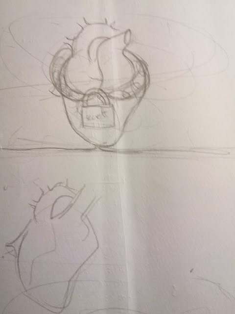
The general idea is that throughout the animation there will be a line from which all the animated objects will form. I will be animating a Ford Cortina, a shooting gun and an exploding heart.
The hardest part will be definitely getting the animation in sync with the lyrics


Here's our timing sheet (yes, it's very messy and chaotic) 
 Here's the actually important part.
 some more sketches for the formation and movement of the car and the gun

Week 7 Homework - Framing

For homework, we were supposed to pick a film and then storyboard the key points of a 15-minute sequence. I chose the movie "Constantine" because I like it and as it turns out it has some nice framing (at least in  my opinion). I did the last fight/action scene from the movie. There is a lot going on so I wasn't able to do all the frames I'd have liked to because that would take me ages and it would be way too long. These should be some of the more important frames story wise, if someone hasn't seen the movie though, they'd  probably be really confused because there's a lot of information missing.