For this week we had to "collect" an alphabet. I chose letters that I liked or, in some cases, letters that I was glad I even found.
The whole process in Illustrator was a bit confusing at first and I couldn't get some of the things to function as they should. For example, I've had trouble changing the colour of the texture after doing making a clipping mask, but I figured it out eventually. I also feel like I haven't chosen very well texture wise. I wasn't expecting to be doing this with the textures and so they were very subtle and when converted to bitmap, some of them just looked like noise. Next time I'd choose things with more contrasting colours and shapes to make the letters more interesting.


I've decided to make my name. ("S" was originally a bit too complicated and the texture wouldn't show so I just made it all black)
Progress pictures:


The finished letters. I've been trying to use limited colour pallettes so I just used different shades of blue, purple, and gold for contrast.


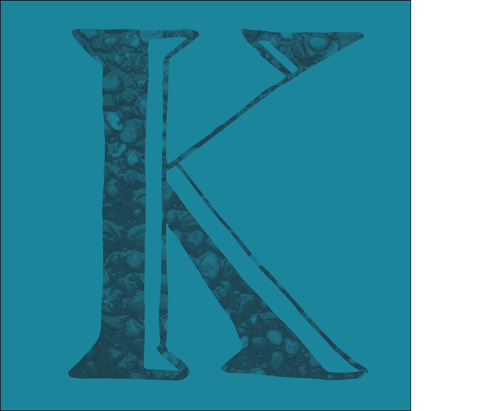


I played with the colours of the textures afterwards a bit to make all the letters as visible as possible

0 Komentar