Final brief - roughs

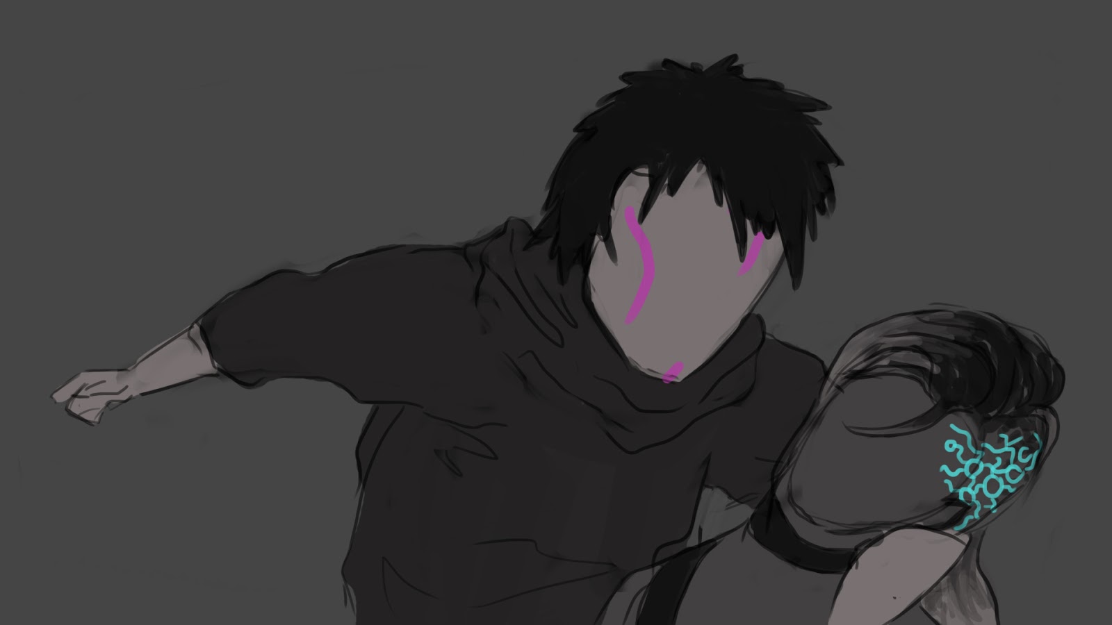
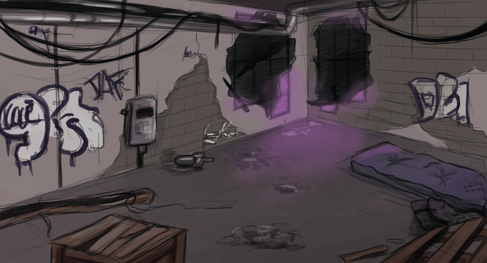
I've done some quick thumbnail sketches and then did some of them digitally as well.
This is the only illustration that basically stayed as it is since the beginning. 

 I was considering illustrating the scene where she strangles him with his hair, but I couldn't find a way to make it look the way I wanted, so this idea never left the stage of a sketch.


This was originally intended as the book cover, but then I've decided to go with the sketch below for cover and turn the one above into something else.


Week 10 - Lasercuting

I have chosen the quote "All art is quite useless" by Oscar Wilde. My only intention with this quote was to find/make some letterforms I liked and put them together. My first attempt was a bit of a mess, I wanted to see just how many different letters I could combine before it would start looking like too much and the answer was "less than that". So I went with 1 style for 1 word. I feel like this was the only approach that would work well with the quote. Maybe I could've been more creative with the letterforms, though. 


 Second "S" wouldn't fit on the page so I copied the first one in photoshop.
 

The result:


Week 9(2) - Hive

During the last lesson we made maze books and went sketching to the Hive. I'm still not completely comfortable drawing in public, which makes it hard to focus sometimes, but I'm getting used to it. I mostly focused on people in the library, but I have some sketches of other things as well.
In general, I don't think that my sketches from this lesson were very successful.

The person disappeared before I could get any more done.


I wanted to draw the ceiling, but something went wrong in both attempts,


I tried to draw the silver shape, it wasn't going too badly, but I think I should've just left it as line drawing instead of trying to quickly shade it because it doesn't look very good.


Week 8 - Letterforms

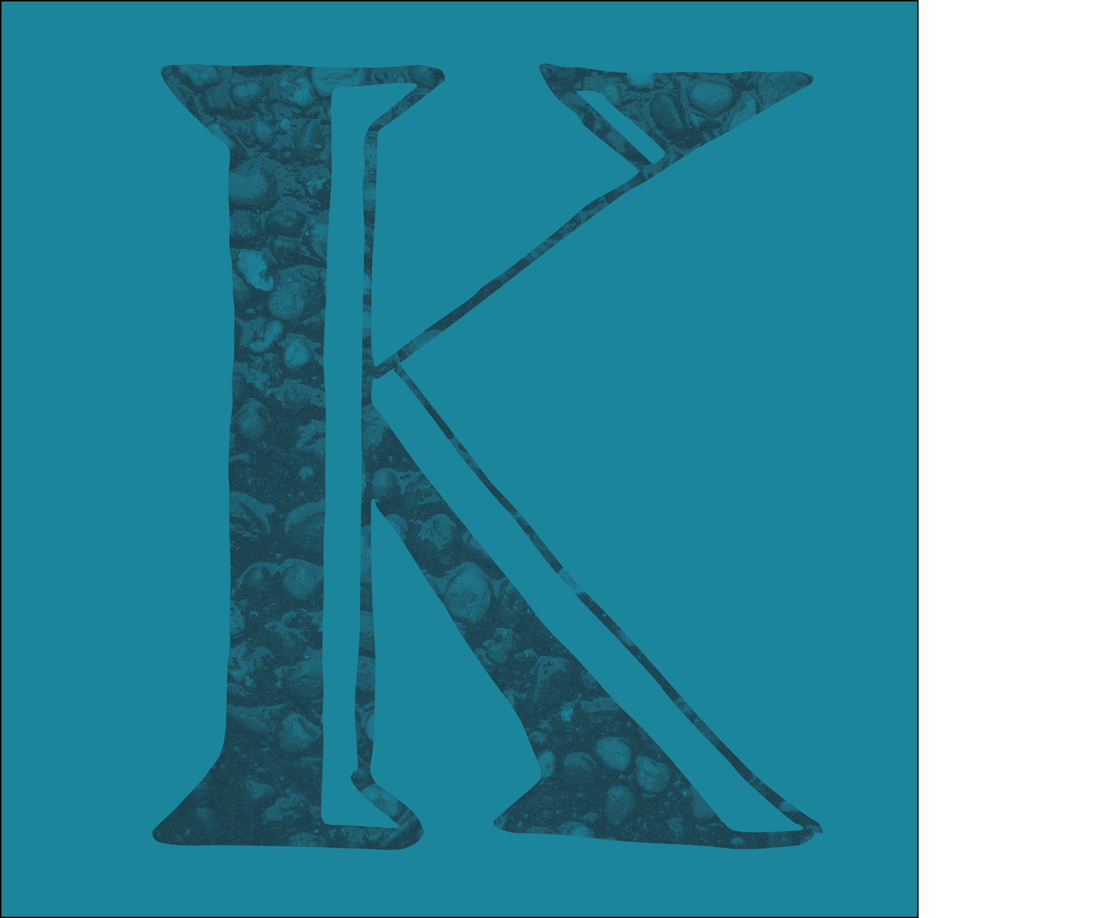
For this week we had to "collect" an alphabet. I chose letters that I liked or, in some cases, letters that I was glad I even found. 
The whole process in Illustrator was a bit confusing at first and I couldn't get some of the things to function as they should. For example, I've had trouble changing the colour of the texture after doing making a clipping mask, but I figured it out eventually. I also feel like I haven't chosen very well texture wise. I wasn't expecting to be doing this with the textures and so they were very subtle and when converted to bitmap, some of them just looked like noise. Next time I'd choose things with more contrasting colours and shapes to make the letters more interesting. 


I've decided to make my name. ("S" was originally a bit too complicated and the texture wouldn't show so I just made it all black)
Progress pictures: 


The finished letters. I've been trying to use limited colour pallettes so I just used different shades of blue, purple, and gold for contrast.


I played with the colours of the textures afterwards a bit to make all the letters as visible as possible


Week 8(2) - Riverwalk and recompositing nature

This week we went sketching around the river. I was trying to look for some interesting compositions that could be improved by adding elements, but I also sketched things that simply caught my interest somehow. I enjoyed combining different elements into one drawing, but now that I'm thinking about it, I could've used colour in at least one of them.


I drew some thumbnails of what I wanted to draw. I ended up changing some things that just weren't working as I'd imagined.

I liked the staircase as it was, but figured it could look interesting with some kind of gate. Then I came across these things on the railing and used them as a sort of a gate. I think i should've placed the posts a bit differently because like this they don't really line up with the staircase, which makes it obvious that they were originally not there. My main goal was just to make it look more interesting, but it would've been nice if it looked believable. Maybe it would help if there were some visible shadows. 

I thought the wall with the wires on top and spiky things above the door looked a bit fortress like, so I added some pillar ruins on top and added a chain that I found on a railing somewhere. I also removed a trash can because it was ruining the fortress atmosphere. 

This one is probably my least favourite of the four. I didn't think about it as much as the others, but it's the only one that could look like it wasn't altered. 

This one is my favourite. At first I was afraid I'd gone a bit overboard, but when I saw the cathedral tower sticking out above roofs I just immediately thought about how it could be sticking out of the river. I've used continuous line, though I did a quick sketch of what is going to be where beforehand because I didn't want to risk drawing it without planning.